

Amazon Redesign

This redesign aimed to boost both efficiency and confidence by streamlining the buying process, improving AI support for decision-making, and adding a subscription calculator to assist non-Prime users.
Product Manager
Engineer
UX Researcher
Product Designer
Duration
Tools
2 Months + Iteration
Figma & Protopie
Responsibilites
Collaboration
BACKGROUND
As one of the users, I have always had a love/hate feeling for Amazon. Whenever I needed something urgently, it always saved my life. But I would only go there when I had no choice because the site and its shopping experience were boring.
As a UX designer, why not redesign it?
How might we make it better?
HMW enhance users' engagement in BofA?
HMW strengthen users’ loyalty to the product, motivate target users to use BofA more often?
HMW use technology to make it more efficient?
How can we help the business and users?
Redesigning Amazon’s user experience offers substantial long-term business benefits. The redesign enhances customer satisfaction by boosting efficiency and confidence through a streamlined interface, fostering loyalty, and increasing repeat purchases. Optimizing navigation, improving AI-driven decision-making, and integrating a Prime subscription calculator for non-Prime users can drive higher conversion rates and expand Prime memberships. These improvements cater to a broader customer base while providing data-driven insights for more precise marketing strategies. Ultimately, a superior user experience strengthens Amazon’s competitive edge, solidifying its leadership in the e-commerce space.

Outcome
Task Completion Time
⬇**%
Task Completion Rate
⬆**%
User Satisfaction Rate
⬆**%


A SNEAK PEEK

The UX process takes 2 months.
RESEARCH
How does a shopping platform of this scale end up with such a negative image?
In analyzing app store comments, a significant number of reviews reveal a negative perception of Amazon. Users describe the platform as frustrating, shifting Amazon’s image from user-friendly to manipulative, annoying and untrustworthy

A mobile app with a mediocre UX
According to Baymard's UX measurements, the overall user experience performance of the Amazon mobile app falls in the low to medium range. Despite this mediocre overall rating, some areas are notably flawed, and there are no aspects rated as very good.

Who are our main users?
Primers.
Primers are a huge part of Amazon's user base. The number of users in the U.S. will reach 167 million in 2023, and about 71% of U.S. Amazon shoppers are Prime.

However, Primers don’t buy anymore.
According to Statista, Amazon Prime members purchased significantly fewer items during Amazon Prime Day in 2024 than in 2023.

Target at Prime users can boost Amazon’s business value
Primers show more engagement. Purchases from subscribers are greater than those from non-subscribers.
Primers show long-term loyalty. Less than 1% of Amazon Prime users visit other physical or online competitors while shopping on Amazon.
Primers have strong user retention. The longer users use Prime, the more likely they are to renew.

What’s stopping them from placing the order?


Target Audience
I am redesigning Amazon for

Persona


Problem Reframing
Now, how might we make the Amazon app better?
How might we simplify the shopping flow to help users find what they need more quickly and efficiently?
How might we give users the decision-making support they need to feel more confident in purchasing?
How might we help non-primers who need prime services realize the value of prime?

Set up a clear goal

Learn from competitor

How can the implementation of AI features be more integrated, creative, and helpful?

DESIGN
What functions?
After evaluating the features that we brainstormed out, features with relatively low effort and high user value became the initial scopes for our product.


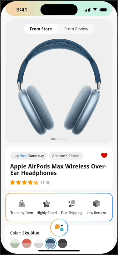
Buying: Bring Efficiency to Users
Satisfied by Purchase during Your 10-min Morning Scroll
The main obstacle for explorers is uncertainty about the products they browse, causing them to lose the impulse to buy quickly.
Action 1: Make the home page and product page layout more consistent with users' mental models
Action 2: All user “quick look” content is easily accessible in two scrolls
Action 3: AI generates visualized a product snapshot


- Browsing & Searching -

- Purchasing -

- Following -

After Buying: Saving & Worry-free
It’s always on Prime, now easier than ever
Don't let the hassle of returns become a concern for users when placing an order.
Action: No more struggling to find return codes across pages, no more matching codes with items—everything is now streamlined in one place.

- Returning -

Non-Prime
Get An Answer Between Make It $25 or Pay the Shipping Fee
More non-prime members do recognize the value of prime but feel they don't need it as much
Action 1: Helps users know the benefit of prime membership
Action 2: Help users determine if they need membership
Action 3: Minimize the sense of pushiness when encouraging users to subscribe.

- Profile -
Different saturation, different Prime subscription status.

Our mission is to ensure that users realize the value of Prime through a seamless and unobstructed user journey
- Non-Prime Calculator -

Rufus gets you confidence
A Salesperson Behind the Counter — There When You Call
The reason users find Rufus annoying is that Rufus doesn't really help them.
Action 1: Rufus doesn't always pledge its presence to the user
Action 2: Rufus anticipates their needs and provides solutions accordingly, naturally blending into users’ journey map
Action 3: Rufus’ goal is to help users in a more neutral tone rather than pushing them to buy

- Rufus Hides -
To minimize repetition and user irritation, we use three progressive designs to place the Rufus button.

At the top of each product page, a card glows outside the screen suggesting users scroll up to access a new layer.
- Rufus Knows -

- Rufus Brands -
All Rufus-assisted content is presented in a unique gradient.

Iterations & Design Tasks
- Approach for Affordance -

- Interaction intuitiveness -

- Cognitive Simplification -

Design System

PROTOTYPE


Retro & Next Step
What did we do well?
We established a clear goal early on: to boost user efficiency and confidence. This well-defined direction and scope helped guide our design, creativity, and user research. It made the process more focused while allowing for creative solutions to emerge.
What could we have done better?
We could have scheduled usability testing earlier and improved internal communication for smoother collaboration. Earlier user surveys would also have helped guide the iterative design process.
What is our iteration plan?
We plan to refine AI integration by enhancing Rufus's personalized guidance. A/B testing will focus on improving interactions and Prime CTAs. We’ll also streamline team communication and feedback to better optimize AI’s impact on the user experience.